


In collaboration with FordLabs, a digital product development division of Ford Motor Company, our team designed and developed a mid-fidelity prototype for an internal platform aimed to connect employees and increase recognition. The platform serves as a dedicated space for Ford employees to celebrate milestones, birthdays, anniversaries, baby showers, and other personal achievements. Our goal was to create a tailored solution that would better meet the unique needs of Ford’s workforce, removing unnecessary features and including new features that align with the company culture.
.png)
.png)
.png)
.png)
.png)

There were two issues with the platform previously used for celebrating and congratulating FordLabs employees, called Kudoboard.


With these two issues in mind, we decided to conduct secondary research on Kudoboard in order to understand what our users were working with.

Now that the current platform was understood, we wanted to dive more into what other existing celebratory platforms already exist. We wanted to do this in order to understand what was already on the market and what they are composed of. We had found many similar platforms used for virtual celebrations. We analyzed their features, what elements they were composed of, as well as their design layouts. After breaking them down, we found ourselves with a better understanding of commonly used themes, various elements used, as well as design formatting.


To gain an understanding of our users needs for this platform, we interviewed 5 FordLabs employees, with the specific goals of the interviews listed below.


Understand Fordlabs current social interactions
Explore their needs for virtual celebrations
Identify any pain points in the current virtual celebration process
The affinity diagram, made from observations and information gathered in interviews, allowed us to group information together under topics such as multimedia, ease of interactions, celebration channel, etc.


Employees appreciate a wide variety of features allowing them to express themselves
Employees prefer simplicity and time efficiency within platforms regarding virtual celebrations
Fordlabs social culture currently includes virtual games and lunches
After the discontinuation of Kudoboard, communication regarding virtual celebrations and shoutouts are currently on Slack and Webex
After gaining and evaluating these insights, it was time to begin ideating potential design solutions, using all previously gathered insights. To do so, we conducted "Crazy 8 Sketching" as well as a site flow.


We had completed a Crazy 8 sketching session, where members of the team get 8 minutes to draw 8 different sketches of interfaces, icons, ideas, etc. This activity allowed us to foster creativity and explore potential layouts for our information and features.
After discussing all features and ideas from the Crazy 8, my team and I had organized essential features into 3 separate pages.
We had used the site flow as a template, and created these prototypes in order to have a rough layout of our ideas based on those prior takeaways, as well as having something to begin user testing with.


We had conducted usability testing with the same 5 Fordlabs employees. The protocol consisted of general questions as well as a scenario walk through. There were a few goals for this testing, such as exploring what works well and what needs work, evaluating the effectiveness of the current presentation, and determining necessity of potential features.
Our insights gathered from user testing allowed us to increase usability.

Clutter among the home page side panels
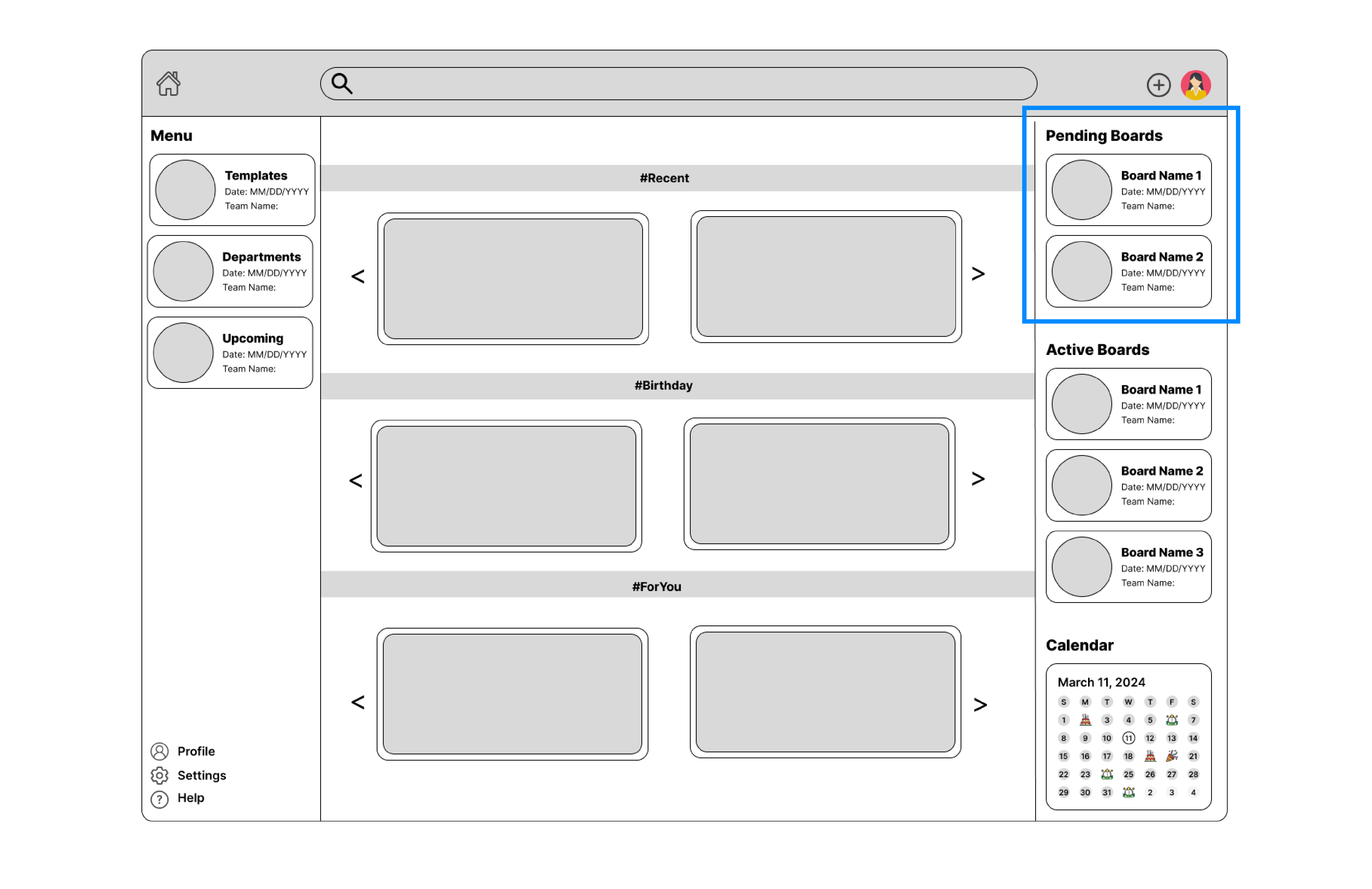
Confusion about the meaning of 'pending' and 'active' boards

The meaning of hashtags
The insights from user testing had allowed us to declutter the side panel, get rid of hashtags, and switch "pending" boards to "In-Progress" boards, allowing the interface to be more aesthetically pleasing as well as increasing usability.


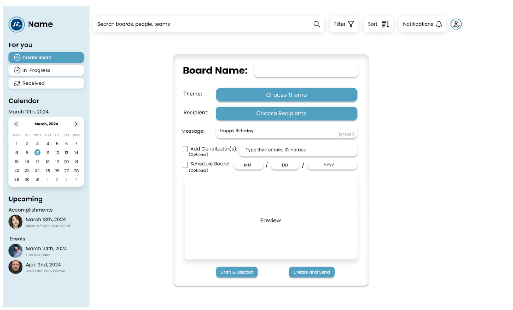


We had conducted user testing on the high fidelity prototype to sharpen our platform again. There were 3 insights found from this testing.

Confusion about the significance of the 'select' button

Make the board name easier to understand

Confusion about weather "create board" is navigational or a button
Due to time constraints, we were not able to design again to solve these pain points, but had handed them over to our sponsors in a transition document.


Do not make assumptions about what the stakeholder will think! Just because gifts are typically given for celebrations, does not mean our users would want a feature that facilitates this.
Not everyone will understand certain features or words the same way you do. We had multiple features and navigational buttons that simply did not make sense to our users, this is why user testing is so important and can eliminate confusion for stakeholders.
Make sure the questions in user testing are not guided questions. We had run into an issue when testing, where our questions ended up being guided, therefor ruining a bit of work and wasting time. Making sure these questions are completely unbiased will allow participants to give fully candid answers, being very valuable for the next steps.

I would like to thank my teammates, Tejsavi,Damaris, Joel, Joe, Kavni, Mahi, Prithvi, Erica, and Isaac for a fantastic semester! Also a special thanks to our sponsors Lukas and Juliet who guided us throughout the project, and gave us insight that helped us grow as designers!
If you like what you see and want to work together, get in touch!
Claireomalley30@yahoo.com